On 19/06/2008, at 12:23 AM, Mike Schrag wrote:
>>> I've been experimenting some with Eclipse's emulated tabs on OS
>>> X ... This is the tabs with an implementation of the Safari tab
>>> style:
>>
>> Not nice :(
>>
>> a) the tabs in safari are for documents, not "info panels" which is
>> what the tabs in the lower part are.
>> b) the icons are important info and the text is very hard to read
> Well, I agree, or I'd commit it :) Well, I agree with "a". I'm
> still not convinced the icons are important at all in these
> views ... I don't think OS X uses icons on tabs in any app I've ever
> seen. Granted Eclipse has way more tabs than most apps, but, to me,
> it just means that you end up with 1000 icons on the screen and they
> all just turn into visual mush. If it just said the labels, would
> it affect access time at all?
>
> OS X really has NO standard for this type of control:
>
> Current Eclipse (totally looks like Windows):
> <iChat Image(2310319135).jpeg>
> <...>
> Basically we need a tab with a label, icon, close, small vertical
> space, that can fit inside a view naturally and look like it fits
> into OS X. If anyone has seen such a beast in any OS X apps, let me
> know.
Attaching screenies...
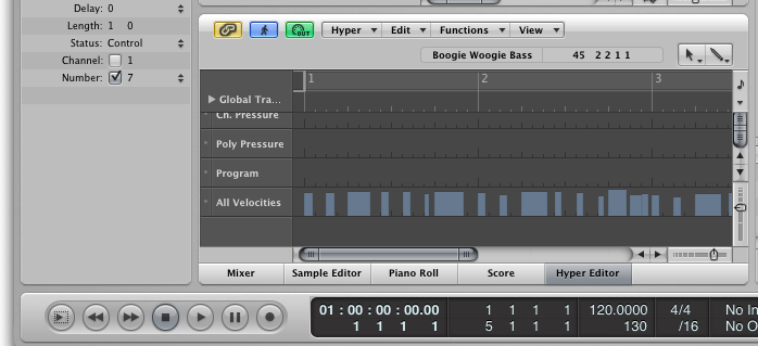
- Logic Pro (show/hide tab)
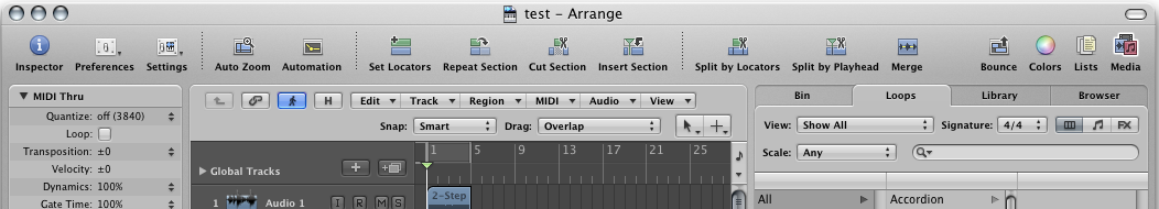
- Logic Pro main arrange
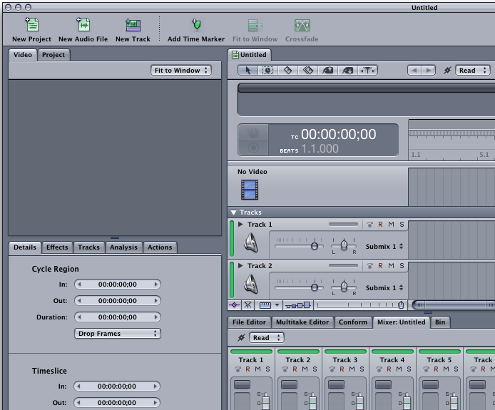
- Soundtrack Pro (notice icon in tab)
Both Apple products...
with regards,
--Lachlan Deck
This archive was generated by hypermail 2.0.0 : Wed Jun 18 2008 - 21:20:42 EDT