- Previous message: Mike Schrag: "Re: how SHOULD it look"
- In reply to: Mike Schrag: "Re: how SHOULD it look"
- Next in thread: Mike Schrag: "Re: how SHOULD it look"
- Reply: Mike Schrag: "Re: how SHOULD it look"
- Messages sorted by: [ date ] [ thread ] [ subject ] [ author ]
Looks great Mike,
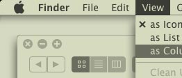
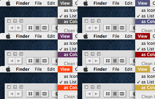
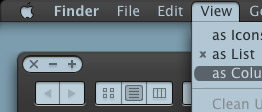
Now the minimise and maximise look out of place.
I've dug out some screenshots off of http://interfacelift.com/themes-mac/


On 03/07/2008, at 1:16 PM, Mike Schrag wrote:
>>>> The view menu triangle seems like it would be almost synonymous
>>>> with the mac's "Action" menu
>>>> The Finder one is quite large and would not necessarily mean it
>>>> would have to be a popup menu
>>> Yeah. I hate that triangle. Apple uses many different sizes of
>>> this icon. Stealing the variant from Mail.app:
>>>
>>> <pastedGraphic.png>
>>
>> This is what quicksilver uses:
>> <Picture 5.png>
>
> <pastedGraphic.png>
>
- Next message: Mike Schrag: "Re: how SHOULD it look"
- Previous message: Mike Schrag: "Re: how SHOULD it look"
- In reply to: Mike Schrag: "Re: how SHOULD it look"
- Next in thread: Mike Schrag: "Re: how SHOULD it look"
- Reply: Mike Schrag: "Re: how SHOULD it look"
- Messages sorted by: [ date ] [ thread ] [ subject ] [ author ]
This archive was generated by hypermail 2.0.0 : Thu Jul 03 2008 - 17:15:52 EDT