>> yeah, it totally agree, just we shouldn't use the gel caps for this
>> as they are associated with a window, not a subsection of a window.
>>
>> Maybe just a plus and minus in a black circle will be enough. I'm
>> not sure how other people use eclipse, but I rarely min/maximise.
> Oh ,yeah ... Definitely. I'm going to try out the "X" style that is
> used for closing tabs but drawing a +/- inside of it.
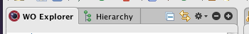
This isn't up yet -- Haven't done any of the rollover states:
They're a little heavy, actually, next to the gear, which is the same
color but about half the visual weight .... I'm wondering if I should
do a gear inside of the same kind of circle, but I think I'd have to
lose the triangle to do it to keep it from looking weird. The gear is
also a 10 px diameter circle whereas close/plus/minus are two pixel
diameters. To beef up the gear means making it wider, though, to
maintain the same proportions with the triangle. I'm not sure it will
still be enough, either. Opinions? Am I being too picky? Actually, I
think the gear should definitely be 12 px diameter now that I'm
looking at it. It would look a lot better. Time to head home, but
I'll clean it up tonight. That might be enough to just make it the
same size. I'm curious what the X would look like as that + turned 45
degrees also rather than the thinner Safari-style X that it is now. I
think at 45 degrees the arms might not be long enough -- it might turn
into a gray mush when it antialiases that angle. Oh well.
ms
This archive was generated by hypermail 2.0.0 : Thu Jul 03 2008 - 18:05:53 EDT