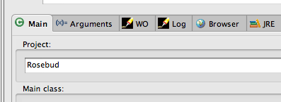
The horizontal hairline under the tab bar makes anything that has
white content look much better (it's not just a drop-off)
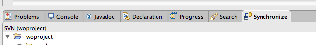
At the expense of things that have gray at the top (this particular
case isn't using the view pane label, which I explicitly check for):
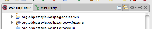
Like this one is:
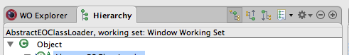
And these kind of views will just always have the hairline, because I
can't detect that it's gray:
Soooooo...... I think I'm going to take it back out, but thought I'd
solicit opinions. I think the case where it messes up just looks too
goofy (especially as demonstrated in example #2)
ms
This archive was generated by hypermail 2.0.0 : Tue Nov 25 2008 - 07:32:12 EST